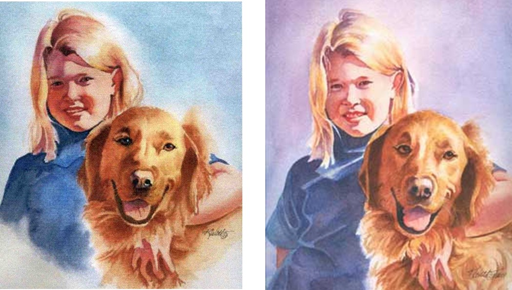
I thought we would take a break from the wolf painting and talk about color and how you can use it to make a better painting. These are watercolors but the principles of color can be applied to any medium.
“Good Friends” “Best Friends”

Here are two paintings. “Good Friends” was painted first and although I was pleased with the result, I wanted to paint it “more thoughtfully”. The result is “Best Friends “.
I set out to accomplish three objectives. First I wanted to achieve a better likeness. I missed something on the first try. Secondly, I wanted to use color in a more interactive way, using compliments to focus the eye of the viewer on the center of attention. Finally, I wanted to use more glazing in this painting in addition to my usual direct approach.
In “Best Friends “, I wanted to create a color vibration between the hair and the background, so that the viewer’s eye would be directed to the girl’s face first. The hair color is most intense on the left side of the face, at eye level where I placed the brightest purple background tone (purple is the compliment of yellow). In addition, I used more purple in the shadows of the hair to give a nice color variation, rather than using a brown or burnt sienna shade. I painted the skin tones in my usual manner using two or three washes, and then glazed over the shadow side with a purple wash to “push back” the face and allow the hair to come forward. I liked the result very much. As you can see, glazing creates subtle color variations that cannot be achieved with just using darker hues of paint. This process makes the painting more interesting to look at.
Compare the two paintings. In your own work, you may try using complimentary mixtures to create more interesting paintings
